


Glass & glazing Blog
Choose a Perfect Kitchen Colour Scheme
Colour scheme plays a great role when it comes to design a kitchen. It includes colours starting from the walls, to the flooring of the area. These hues are actually important as it helps in defining if the it will work the way you want or not. In fact it leaves a dramatic impact on your mood and the entire ambience of the kitchen. The important thing here to note is this that not everyone has a blank canvas to start with the designing of a kitchen. Many times it just needs a new touch and innovation. However here are some other factors too that help in styling it appropriately.
The Theme of your Home
Often there is a natural concentration to retain the existing style of the house. For instance if your property gives a traditional feel, you would like to keep a touch of it rather than giving it a completely contemporary look, which is not wrong at all.
The Light Source in the Kitchen
The amount of natural light that your house receives generally influences the colour scheme of the place. To elaborate: bright colours will fit well in a dark area. This actually makes the space look bigger as well as brighter.
Which Direction your Kitchen Faces
In which direction is the face of your kitchen also plays a great role. There is a possibility that the colour schemes that look perfect in one space may look dull in another. This is actually due to the quality of light your space is experiencing. This depends on the four directions your kitchen’s face is in like North, south, east or west. Light quality thus affect in seeing how colour and different light qualities alter the things and how these appear to us. This can actually turn the affects and the moods iten. Rooms facing north basically have a limited and consistent light flow according to which the colour flow does not change. On the other hand, South facing rooms also experience lots of light which will be consistently bright again.
Depending on these factors, you can carry on with the designing of your space.
Luckily there are some common colour principles that you can use to determine the effect of various colours of the room.
Dark Coloured Kitchen Splashbacks
Dark colour tones like black, grey and brown have actually become the most popular colour choices for the kitchens. And here being at the cold side of the colour wheel these need to be introduced with care and are in fact best for South facing rooms which receive sunlight to safeguard the room from smell and other dirty stuff.
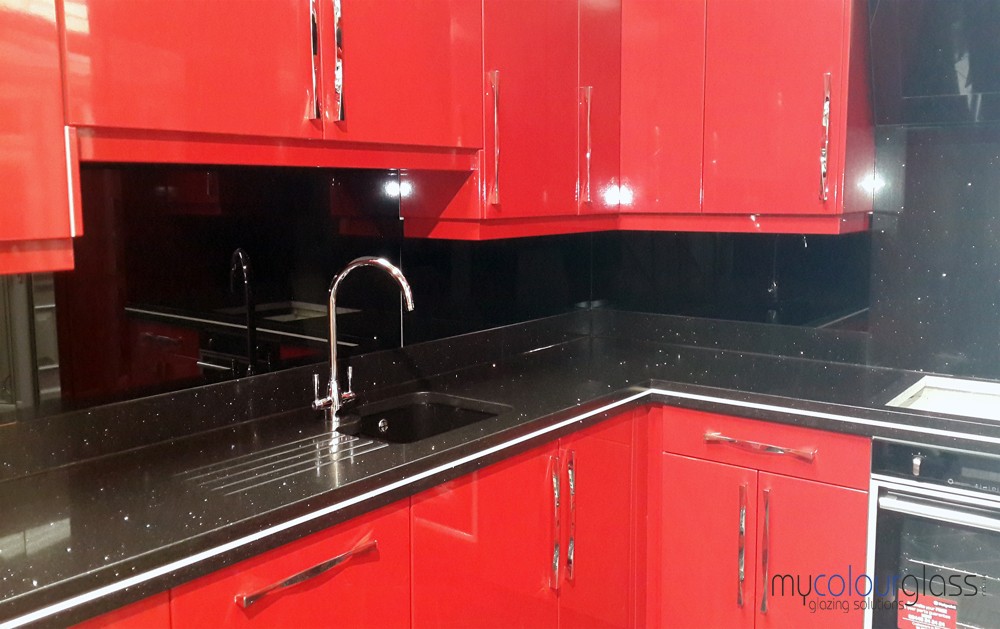
Red Coloured Kitchen Splashbacks
As the red colour signifies the danger, it is the colour to be approached with cautions because there are a lot of red tones available. Now the point is what is it that can have the varied effects on the room’s overall ambience and appearance. A bold red colour should actually work in but if your room has somewhat small space, it may give it an overpowering appearance. Bold red is a colour perfect for creating an energetic, attractive and a modern look to your space. It is basically used in association with white and grey tones or otherwise introduction of black hints create different contrast and a bit exotic feel. The red coloured kitchen splashbacks tend to offer a more formal appearance, or the serious feel which is completely sophisticated, dramatic and yet bordering. Thus a splashback with red colour can transform the perception of kitchen area which makes it feel nearer than it actually is.